Meta.com
Meta.com



I unified a disconnected store and web experience and the teams behind them around a shared design standard, replacing inconsistent, siloed surfaces with a self-service system that lets every property be both beautiful and performant.
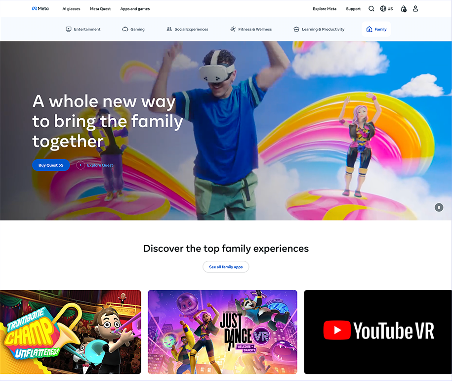
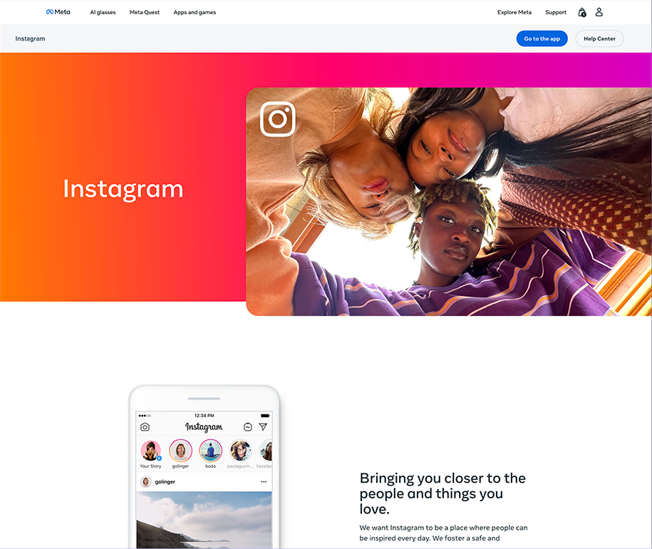
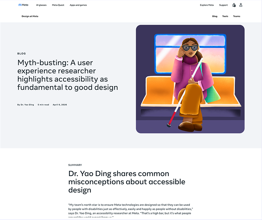
Meta's hardware ambitions (Quest, Ray-Ban Meta, Oakley Meta) had outpaced its web presence. The products were premium, but the web experience wasn't. A myriad of teams and external vendors were working on the website with no shared design language or performance baseline. This required more than a redesign, it required a new collaboration paradigm amongst the teams to reach for a higher bar of design. To get there, we set a premium standard on Meta.com, proved it drove results, then scaled it across the store experience and 20 Tier 1 partner properties, each with its own team, priorities, and constraints.
The Meta.com store redesign drove +5% wearables conversion and +6.7% increase in add-to-cart lift, exceeding the program's sales goal by 120%. That success served as the catalyst for a new web standard across Meta: every surface should be both beautiful and performant.

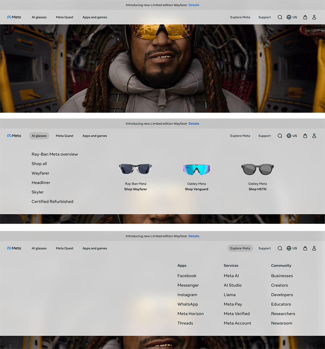
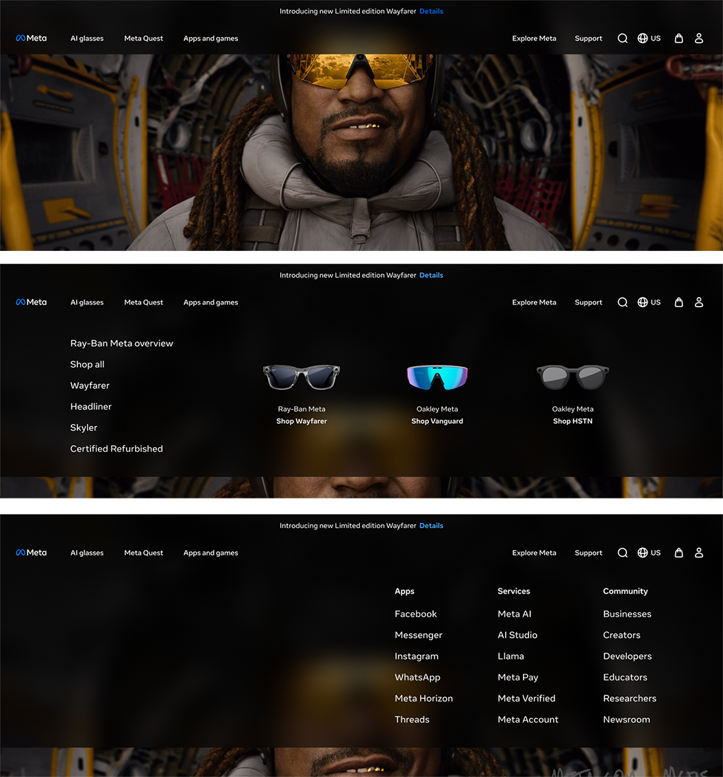

Rather than mandating a design system across 20+ partner teams up front, I set the strategy to prove the model on a single surface first. I directed my team through building the wayfinding and design system for Meta.com's store refresh, then used the outcome - +5% wearables conversion, +6.7% add-to-cart lift, and 120% of the sales goal - as the evidence base for voluntary adoption. The numbers made the case so compelling that teams chose to adopt, rather than needing a mandate to migrate their work.
The biggest obstacle wasn't a gap in design partnership; it was that the functions responsible for these surfaces had been operating independently, each with its own roadmap, tooling, and definition of quality, with little connective tissue between them. That was a natural byproduct of how quickly the organization had scaled, but it meant no single function was set up to align the work end-to-end. I chose to have Design fill that role by offering a shared language and a common bar for quality. Design gave otherwise independent teams both a reason and a practical means to move in the same direction, and became the throughline that unified their efforts.
I was accountable on two fronts simultaneously. On one, I stayed hands-on, directing my own team's build of the standard for wayfinding, the design system, component architecture, and a custom content management system, work that contributed to a +20% increase in nav clicks. On the other hand, I set the stage for coordination with 20+ external partner teams over which I had no direct authority. My strategy focused on self-service: rather than brokering every decision, I directed the creation of enablement tools, guidelines, documentation, component libraries, and performance benchmarks that allowed teams to adopt the standard on their own timeline.
Premium meant that the web had to feel as considered as the hardware itself. For this program, I defined that in terms the extended team could assess quality against.
Setting these standards rejected the usual trade-off between performance and visual richness, making performance a first-class constraint inside the definition of premium. "Good" meant beautiful and fast, never one at the expense of the other.
On compressed timelines, I deliberately managed escalations and drove leadership presentations rather than waiting to be asked. I made sure senior stakeholders had visibility at every key moment, and the C-suite praised the work and outcomes.
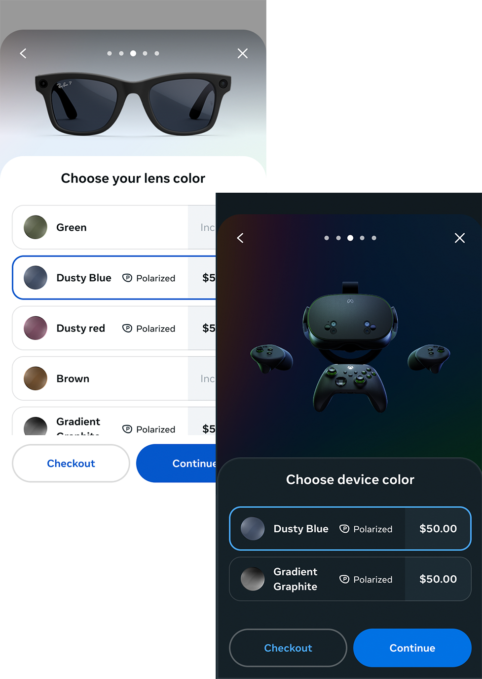


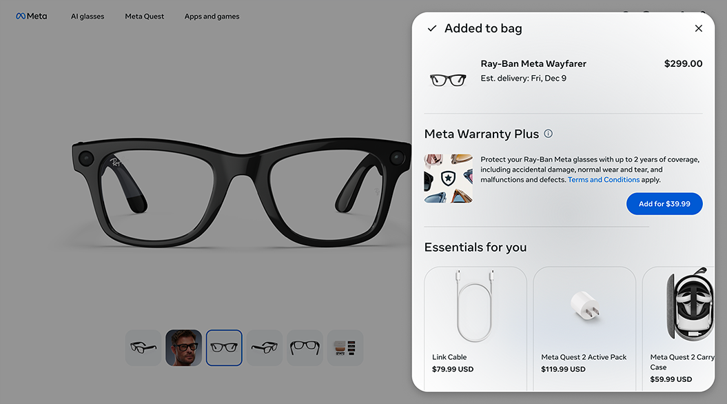
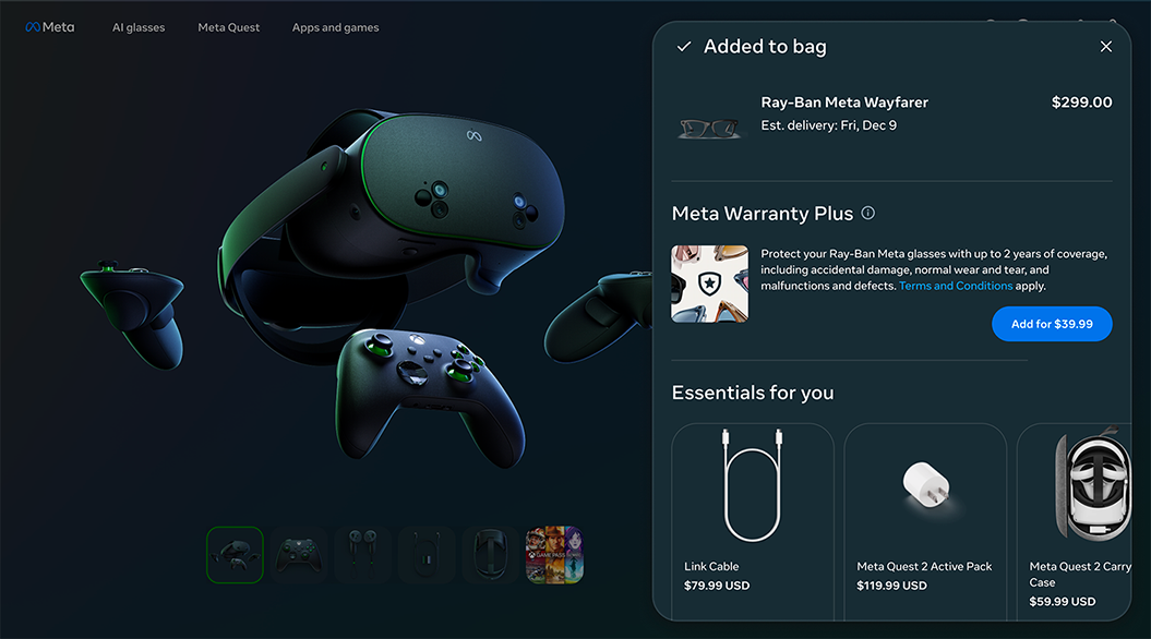
For the design work to be impactful, it had to establish a standard that scales. Meta.com proved that premium design drives conversion. Direct partnership with the store proved craft and quality could scale. Twenty Tier 1 partners demonstrated the ability to scale through enablement rather than mandates, setting the standard for flexes to new products and extensions.