WLM2013
WLM

Walmart

MAKING A MASSIVE MOBILE RETAIL EXPERIENCE MORE COHESIVE

>>>
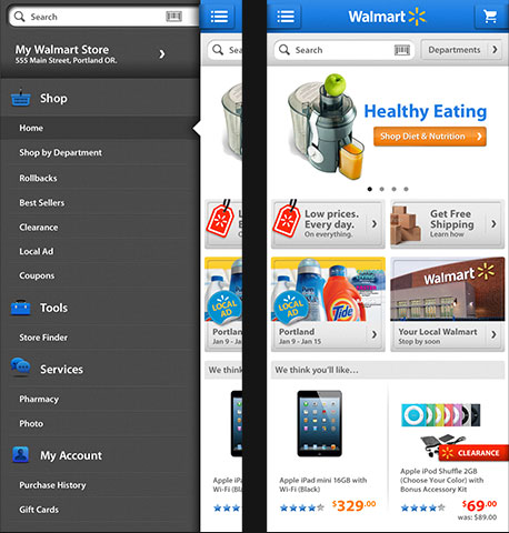
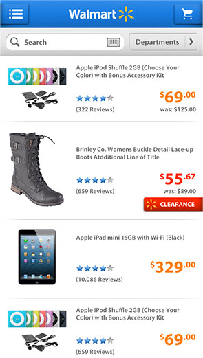
2 phones showing Walmart app screens
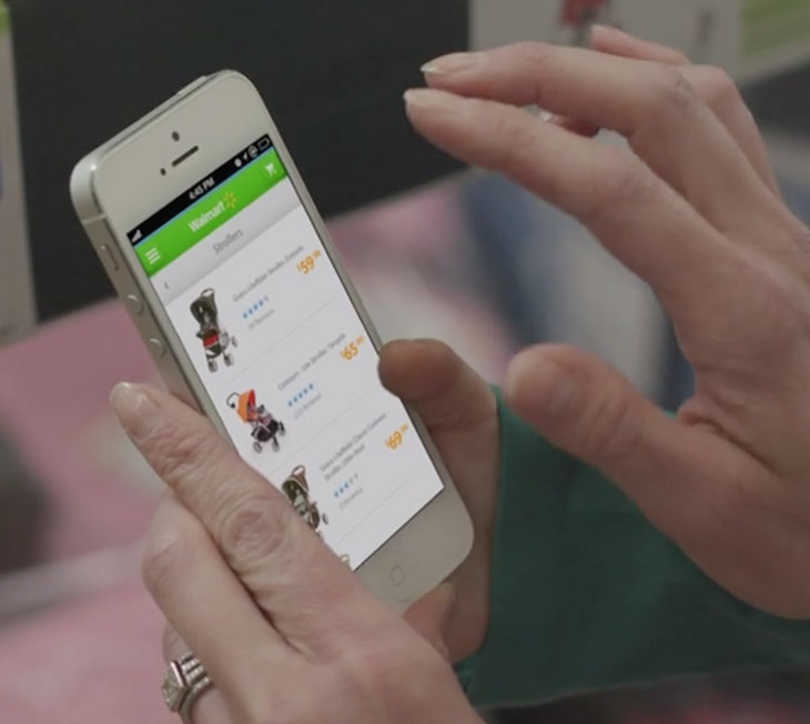
Person holding phone viewing Walmart app

EVERYONE ON THE SAME PAGE

In 2013, Walmart’s mobile presence was splintered across different devices and sales channels. We were tasked with conceptualizing a cohesive design system to make updating easier across all platforms and add some surprise and delight.

Walmart also needed to incorporate new features such as scan-and-go, shopping lists, and pharmacy options. The goal was to make the Walmart app a destination for shoppers in and out of the store.
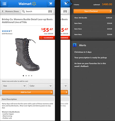
Screens showing menu of Walmart appWalmart app screenScreens showing menu of Walmart app

IT’S ALL IN THE DETAILS

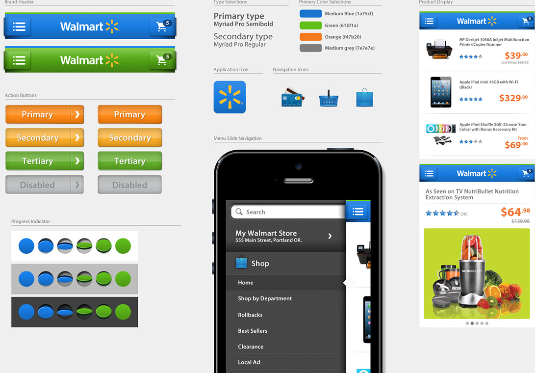
In design systems, getting the details right is key, especially with such a large brand. From the first impression of the application icon, to defining the use of flat and dimensional design, revealed menus, product image sizes, savings callouts, your shopping cart, no screen was left unturned.
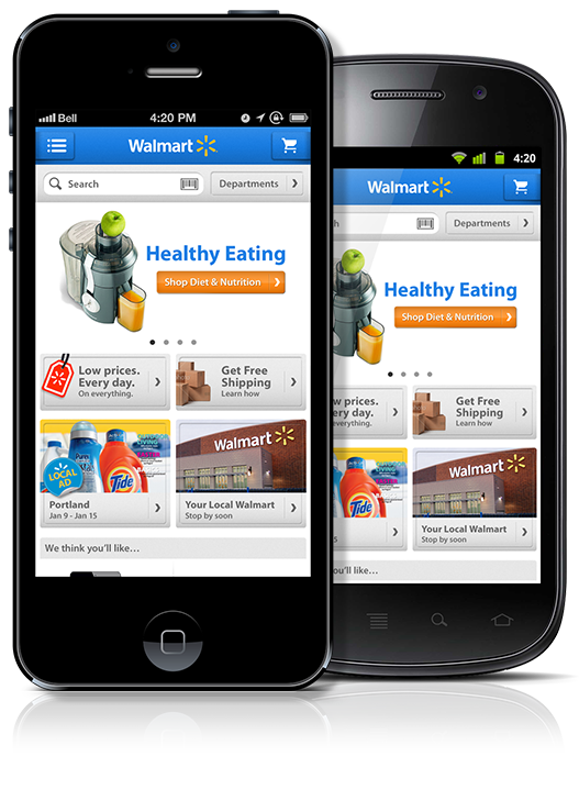
Person holding phone with screen from Walmart
Walmart UI design assets for design system

ROOM TO GROW

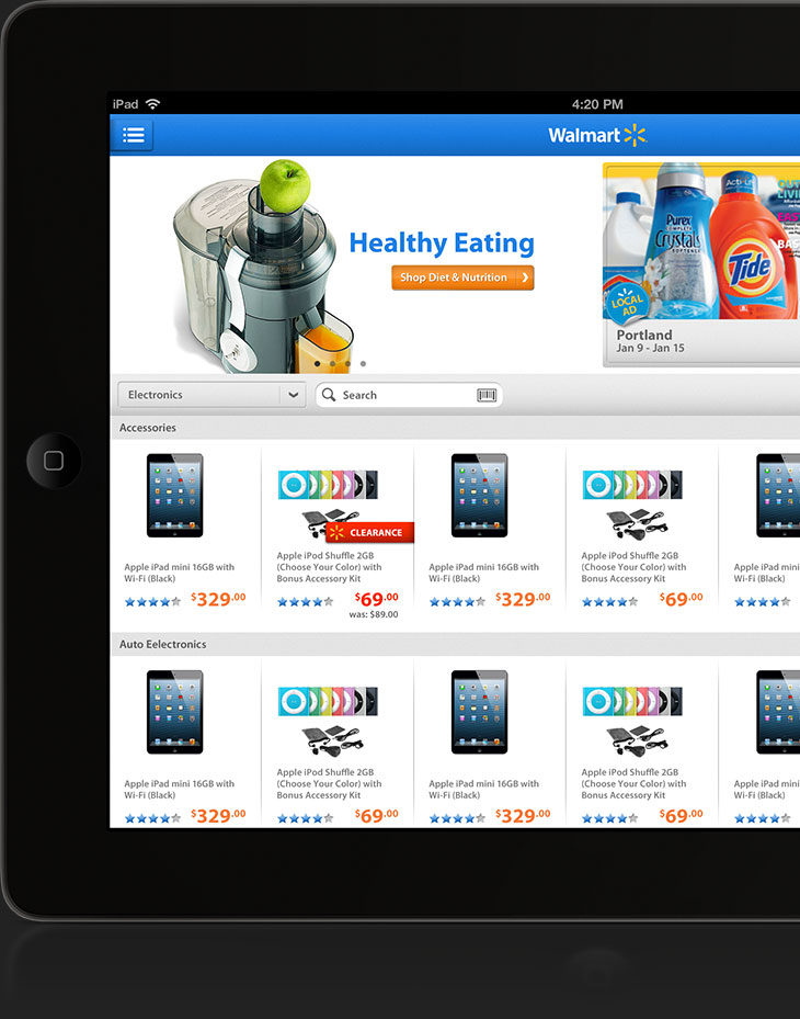
Expanding into devices beyond phones was an important element of this exploratory design. We expanded the visual language into a more robust shopping experience for tablets that allowed shoppers the same great experience as mobile while using all screen real estate possible.